NSE & BSE Option Chain - Auto Option Data InputDefinition
An options chain is a list of all available option contracts for a specific security, organized by expiration date and strike price.
What Is an Options Chain ?
Understanding how to read and analyze options chains is crucial for investors venturing into options trading. These display all available option contracts for a particular security, typically in a table format that organizes contracts by expiration date and strike price. The tool provides a wealth of information at a glance, including present prices, trading volume, and implied volatility (IV) for both call and put options.
While the long list of prices and other information can look at first to be overly complicated, learning to navigate an options chain will significantly improve your ability to trade in these derivatives and identify prospects in the market. As options continue to gain popularity among retail investors, mastering the intricacies of the options chain has become an essential skill for those looking to expand their trading strategies beyond traditional stock investments.
Key Takeaways
An options chain displays all available option contracts for a security, organized by expiration date and strike price.
Options chains typically show each contract's bid price, ask price, volume, open interest, and implied volatility (IV).
Options chains can be used to identify trading prospects, such as mispriced options or favorable risk-reward scenarios.
Understanding Options Chains
Option chains list all available option contracts for a particular underlying security. For traders, they provide a snapshot of crucial information about each contract, including strike prices, expiration dates, and market prices.
Typically organized in a table, options chains have separate sections for call and put options. The rows represent different strike prices, while the columns show various data points for each contract. This lets traders quickly compare options with different characteristics to make informed decisions.
Decoding Options Chains
The columns of an option chain, as seen in the example chart above, include the following:
Strike price: The price the option holder can buy (for calls) or sell (for puts) the underlying asset.
Expiration date: The last day the option contract is valid.
1
Bid price: The highest price a buyer is willing to pay for the option.
Ask price: The lowest price a seller is willing to accept for the option.
Last price: The most recent trading price for the option.
Percentage change: The net change column reflects the direction (up, down, or flat) for the underlying asset, as well as the amount of the price shift.
Volume: The number of contracts traded during the current session.
2
Open interest: The total of outstanding contracts.
Mastering the art of reading options chains is essential for any serious options trader. It's where market sentiment, price inefficiencies, and trading prospects all come together.
In options trading, information is power. A well-analyzed option chain can reveal market inefficiencies that savvy traders can exploit. For example, comparing the bid-ask spread across different strike prices can help identify more liquid options, while analyzing open interest can help you understand market sentiment.
A skilled user can quickly decipher an options chain for what it says about price moves and where there are high and low levels of liquidity. For the best trades, this is critical information. For those not quite there yet, let's break down other parts of the options chain tables into manageable parts:
Calls vs. puts: Option chains typically separate call options (the right to buy) from put options (the right to sell). This division allows traders to focus straightaway on bullish or bearish strategies.
Filters and customization: Most trading platforms enable you to customize your options chain view. You can quickly filter by expiration date, strike price range, or specific Greek values to focus on the most relevant contracts.
The Bottom Line
The options chain is indispensable for options traders, providing a comprehensive view of all available contracts for a given security. By learning to read and analyze options chains, you can gain greater clarity about market sentiment, identify trading prospects, and make more informed decisions for your options strategies.
While it takes a bit of time to become proficient in interpreting all the data presented, mastering the options chain is crucial for those looking to leverage the full potential of options trading in their investment approaches.
Fully Auto Option Data Input for All Currently Available NSE Indices and Stock & BSE Sensex Indices
Cari dalam skrip untuk "Implied volatility"
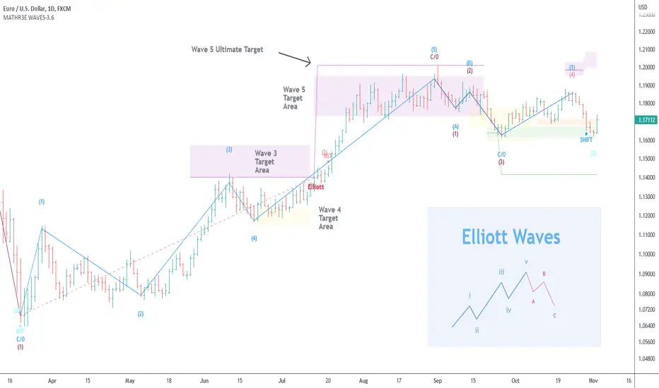
MATHR3E WAVES█ OVERVIEW
MATHR3E WAVES automatically draws Elliott Waves on your charts with their potential associated targets.
█ CONCEPTS
Disclaimer
MATHR3E RETRACEMENTS indicator is intended for advanced traders and may fit your profile, whether you are a day trader or a long-term investor.
It was originally developed by a renowned market analyst and documented in numerous books. Among them is the author Jason Perl.
It is recommended to have read the trading techniques mentioned in the books covering this indicator beforehand.
How to use:
MATHR3E WAVES indicator can provide a roadmap of market direction that you can use to determine price targets and isolate exhaustion points from potential trends in conjunction with other indicators by the same author.
Be aware the indicator's approach is derived from the Elliott wave theory and may slightly diverge from the cardinal rules of Elliott waves.
Principle of the Elliott Wave Theory
Movement in the direction of the trend is unfolding in 5 waves (called motive wave) while any correction against the trend is in three waves (called corrective wave). The movement in the direction of the trend is labeled as 1, 2, 3, 4, and 5. The three-wave correction is labeled as a, b, and c. These patterns can be seen in the long term as well as short term charts.
Wave 1:
Wave one is rarely obvious at its inception. When the first wave of a new bull market begins, the fundamental news is almost universally negative. The previous trend is considered still strongly in force. Fundamental analysts continue to revise their earnings estimates lower; the economy probably does not look strong. Sentiment surveys are decidedly bearish, put options are in vogue, and implied volatility in the options market is high. Volume might increase a bit as prices rise, but not by enough to alert many technical analysts.
Wave 2:
Wave two corrects wave one, but can never extend beyond the starting point of wave one. Typically, the news is still bad. As prices retest the prior low, bearish sentiment quickly builds, and "the crowd" haughtily reminds all that the bear market is still deeply ensconced. Still, some positive signs appear for those who are looking: volume should be lower during wave two than during wave one, prices usually do not retrace more than 61.8% of the wave one gains, and prices should fall in a three-wave pattern.
Wave 3:
Wave three is usually the largest and most powerful wave in a trend. The news is now positive and fundamental analysts start to raise earnings estimates. Prices rise quickly, corrections are short-lived and shallow. Anyone looking to "get in on a pullback" will likely miss the boat. As wave three starts, the news is probably still bearish, and most market players remain negative; but by wave three's midpoint, "the crowd" will often join the new bullish trend. Wave three often extends wave one by a ratio of 1.618:1.
Wave 4:
Wave four is typically clearly corrective. Prices may meander sideways for an extended period, and wave four typically retraces less than 38.2% of wave three. Volume is well below that of wave three. This is a good place to buy a pullback if you understand the potential ahead for wave 5. Still, fourth waves are often frustrating because of their lack of progress in the larger trend.
Wave 5:
Wave five is the final leg in the direction of the dominant trend. The news is almost universally positive and everyone is bullish. Unfortunately, this is when many average investors finally buy-in, right before the top. Volume is often lower in wave five than in wave three, and many momentum indicators start to show divergences (prices reach a new high but the indicators do not reach a new peak).
Wave A:
Corrections are typically harder to identify than impulse moves. In wave A of a bear market, the fundamental news is usually still positive. Most analysts see the drop as a correction in a still-active bull market. Some technical indicators that accompany wave A include increased volume, rising implied volatility in the options markets, and possibly a turn higher in open interest in related futures markets.
Wave B:
Prices reverse higher, which many see as a resumption of the now long-gone bull market. Those familiar with classical technical analysis may see the peak as the right shoulder of a head and shoulders reversal pattern. The volume during wave B should be lower than in wave A. By this point, fundamentals are probably no longer improving, but they most likely have not yet turned negative.
Wave C:
Prices move impulsively lower in five waves. Volume picks up, and by the third leg of wave C, almost everyone realizes that a bear market is firmly entrenched. Wave C is typically at least as large as wave A and often extends to 1.618 times wave A or beyond.
█ FEATURES & BENEFITS
Versatile
The indicator works on relative price action, so you can apply it without having to change any of the default settings.
Targets:
Customize the high and low wave targets to identify possible price target areas.
Adjustable Rules:
• Shift Wave 2: if Wave 4 closes below the low close of Wave 2.
• Shift Wave 4: if Wave A closes below the low close of Wave 4.
• Allow Wave 4 to overlap Wave 1
• Allow truncated Wave 5
• Allow truncated Wave C
Price ratio:
Force waves 2/4 to retrace to a specific Fibonacci level.
Force Waves 3/5 size to a specific Fibonacci level.
Time Ratio:
Force selected waves to last a required number of bars.
Alerts:
Set up your alerts and receive notifications on wave completion.
Alerts format can be adapted to be received on Discord servers.
VIX Strategy : Risk-ON, Risk-OFF
VRatio is the ratio of VIX3M and VIX. This ratio rises above 1.1; in a bear market, it decreases and goes below 1. VRatio=VIX3M/VIX. More details in Part 2.
VRatio > 1: Risk-On signal
Contango is the ratio of VX2 (first back-month contract) and VX1 (front-month contract) minus one. In a bull market, this indicator rises above 5%’ in a downtrend market, this indicator goes below -5%. More details in Part 2.
Contango > -5%: Risk-On signal
Contango Roll is the ratio of VX2 first back-month contract) and the VIX minus one. In a bull market, this indicator rises above 10%’ in a downtrend market, this indicator goes below -10%. More details in Part 2.
Contango Roll > 10%: Risk-On signal
Volatility Risk Premium (VRP) compares the implied volatility to the recent realized volatility; it attempts to quantify how much “extra” premium (in volatility term) S&P500 option sellers are charging investors for the protection of their portfolio. It can be seen as an insurance premium. A simple way to compute the VRP is VRP= VIX -HV10 where HV10 is the 10-day historical volatility of S&P500. Some people also look at the 5-day moving average of the VRP to smooth this indicator.
VRP > 0: Risk-On signal
Fast Volatility Risk Premium (FVRP) is a variant of the VRP. FVRP=EMA(VIX,7)-HV5 where HV5 the 5-day historical volatility of S&P500.
FVRP > 0: Risk-On signal
Volatility Momentum compares today’s VIX to last 50 days. It has, therefore, quite a bit of lag but it is a useful measure when combined with other indicators. Volatility Momentum=SMA(VIX,50) -VIX.
Volatility Momentum > 0: Risk-On signal
VIX Mean Reversion looks at today’s VIX compared to certain thresholds. We avoid investing in the S&P500 when the VIX is too high (above 20) or too low (below 12).
VIX Mean Reversion > 12 and VIX Mean Reversion < 20: Risk-On signal
VIX3M Mean Reversion works the same way as VIX Mean Reversion.
VIX3M Mean Reversion > 12 and VIX3M Mean Reversion < 20: Risk-On signal

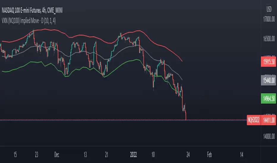
VXN (NQ100 VIX) Implied Move Bands for NQ futures.A spin-off of my similar script for ES futures. This script uses the VXN Index instead of the VIX, which represents the 30-day implied volatility of Nasdaq-100 options and then uses that value to plot bands on the chart, helping traders identify price extremes as identified by the options market. Users can modify the moving average, bands multiplier, and number of lookback days used in the calculation to suit their trading style.
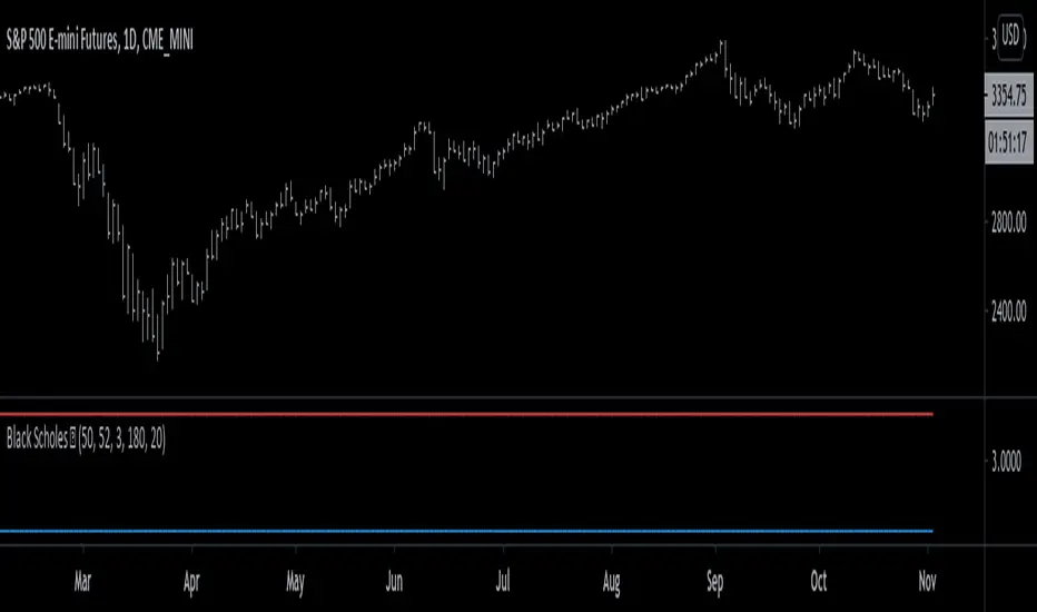
Black Scholes Model [racer8]This is the Black Scholes Model. This indicator tells you the prices of both a call option & a put option.
Input variables are spot price, strike price, risk free rate %, days to maturity, and implied volatility %.
This indicator was made generally for educational purposes.
By using this indicator, you will develop a better understanding of how options are priced.
This indicator was made to be as simple as possible so that the user can easily understand it.
I recreated the Black Scholes Model because there is very little scripts on TV that are based on the Black Scholes Model.
I am aware that are Black Scholes Model (BSM) scripts already on TV, but mine is not the same. Correct me if I'm wrong, but I don't think there is a BSM script out there yet that relies on the exact same inputs that mine does.
Why use this indicator?
If you don't already have your own IV indicator...
You can use this indicator to approximate the value of implied volatility %.
You already know every input variable except IV%, and you know the call & put option prices.
So put in the numbers for each input and put a random number between 0 to 100 into the IV% input to get the options prices.
Adjust that random number for IV% until the output (options prices) matches correctly with what you already know they are to be.
This is called the trial and error method.
On the other hand, if you already know all input variables including IV%. Then you can use this indicator to find the call & put options prices directly.
Hope this helps. Enjoy 🙂
SHUBHAM 50000 ULTRA OPTIONSHUBHAM 50000 ULTRA OPTION
OptionFlow Pro: Smart Money & Anomaly Detection Indicator
Tagline: Don't just follow the flow. Understand it.
Core Concept:
OptionFlow Pro is an advanced, real-time market scanner and visual indicator that transforms raw options chain data into actionable trading intelligence. It goes beyond simple volume and open interest by identifying Unusual Options Activity (UOA), tracking Sweep Orders, and calculating the Volume-Weighted Put/Call Ratio to highlight where institutional "smart money" is placing its bets.
Key Features for Traders:
Unusual Activity & Sweep Detector:
What it does: Scans every tick for orders that significantly deviate from normal trading patterns—large block trades executed at the ask (for calls) or bid (for puts), and "sweep" orders that clean out multiple price levels instantly.
Trader Benefit: Pinpoints potential breakout or breakdown candidates before major moves occur in the underlying stock. Alerts you to aggressive, high-conviction buying or selling that retail traders often miss.
Volume-Weighted Put/Call Ratio (with Trend):
What it does: Calculates the put/call ratio not just by volume, but by the premium spent. A high premium-weighted put/call ratio shows bears are putting serious money behind their bets, making it a stronger signal.
Trader Benefit: Offers a more nuanced view of market sentiment than standard PCR. Helps gauge extreme fear (potential oversold bounce) or complacency (overbought top) in a specific stock or index (SPX/SPY).
Max Pain & Gamma Exposure (GEX) Visualizer:
What it does: Dynamically calculates the "Max Pain" strike (where option sellers face minimal losses) and estimates Gamma Exposure levels. Visual overlays on the chart show key pin levels and large gamma walls.
Trader Benefit: Identifies potential price magnets for weekly/monthly expiry. Understand where hedging activity by market makers may amplify volatility (negative gamma) or suppress it (positive gamma), aiding in entry/exit planning.
Implied Volatility (IV) Rank & Skew Analysis:
What it does: Compares current IV to its historical range (IV Rank) and visualizes the volatility smile/skew across strikes. Highlights expensive vs. cheap option premiums.
Trader Benefit: Empowers you to sell overpriced volatility (high IV Rank) and buy underpriced volatility (low IV Rank). Skew anomalies can signal asymmetric risk/reward opportunities or market fears about a sharp directional move.
Customizable Alerts & Heatmaps:
What it does: Set alerts for specific UOA criteria, PCR spikes, or IV changes. The platform-wide heatmap aggregates flow data across all symbols to show sector-level money movement.
Trader Benefit: Saves hours of manual scanning. Focus only on the setups that match your strategy (e.g., "Alert me for any $1M+ call sweeps in tech stocks").
Who Is It For?
Active Options Traders & Scalpers: Find high-probability directional plays with institutional confirmation.
Hedgers & Portfolio Managers: Identify tail-risk hedging activity and gauge overall market dealer positioning.
Volatility Traders: Precisely time entries for strangles, straddles, or iron condors based on IV regime and gamma.
Swing Traders & Technical Analysts: Confirms or diverges from classic chart patterns (e.g., breakout with strong call flow = higher conviction).
Why It's Different:
Most indicators look backward at price. OptionFlow Pro looks forward at market structure, liquidity, and dealer hedging flows. It doesn't predict the future; it reveals the present positioning that will influence future price action.
Platform Integration: Available as a standalone web platform, a TradingView custom script, and a direct data feed into thinkorswim, Interactive Brokers, and other major brokerages.

Financial Stress Conditions Proxy | QuantLapse📘 Financial Stress Conditions Proxy | QuantLapse
Overview:
The Financial Stress Conditions Proxy (FSCP) by QuantLapse is a multi-factor quantitative indicator that measures systemic financial stress across key macro and liquidity benchmarks.
By blending the High-Yield Spread (BAMLH0A0HYM2), Volatility Index (VIX), Secured Overnight Financing Rate (SOFR), and Reverse Repo Operations (RRPONTSYD) into a unified z-score model, this tool visualizes the market’s underlying tension and relief cycles — conditions often associated with risk-off capitulation and market bottoms.
Each component is normalized via a z-score transformation to express how far current readings deviate from historical means, then averaged into a composite “Financial Stress Score.” The result is a dynamic, color-coded column plot that shifts hue as systemic risk compresses or expands.
Purpose
I built this model to track stress inflection points in the global financial system — particularly to identify moments when macro fear, liquidity withdrawal, and volatility compression converge.
These events often precede bottoming phases across risk assets such as equities and crypto.
The indicator serves as a quantitative proxy for the psychological extremes of the market:
Red tones (high stress): systemic strain, deleveraging, or panic phases — potential long-term opportunity zones.
Yellow-green transition: normalization, improving liquidity conditions.
Blue-teal range: stability and low-stress periods — often mid-cycle.
High Stress zones (Quantitative Tightening) -> Red and Orange
Neutral Zones -> Green and Yellow
Low Stress Zone (Quantitative Easing) --> Green to Blue
How It Works
Inputs & Data Sources
BAMLH0A0HYM2 → High-Yield Corporate Bond Spread (credit stress).
VIX → Implied volatility (equity market fear).
SOFR → Funding rate indicator (short-term liquidity).
RRPONTSYD → Reverse repo operations (systemic liquidity absorption).
Normalization Process
Each data stream is smoothed using a user-defined moving average and standard deviation window (default 150 periods).
A z-score is computed:
𝑍=𝑋−Mean/Standard Deviation
The four z-scores are averaged to produce a single composite stress score.
Color Encoding
The composite score is segmented into 16 calibrated stress bands (from +1.6 to −1.6).
Each band corresponds to a color — red at the top for maximum stress, shifting to bright greens and teals as stress subsides.
Colors are assigned dynamically to the plotted columns, creating an intuitive “heat bar” of systemic tension over time.
Interpretation
Rising, bright red columns: liquidity tightening, macro uncertainty, or panic — potential market bottom zones when fear peaks.
Fading yellow → green: stabilization, easing conditions, and early recovery.
Cool blue/teal tones: complacency or extended calm — often late-cycle risk.
Use the FSCP as a macro overlay, not a direct buy/sell trigger.
Its purpose is to provide environmental context — showing when the market is collectively stressed versus when liquidity and confidence return.
Trading Applications
Bottom Detection:
Historically, sustained red/orange conditions have coincided with market capitulation (macro or crypto bottoms).
Watch for color transitions from red → orange → yellow as potential recovery signals.
Risk Management:
Avoid leverage or high exposure when the score is rising rapidly into red zones.
Gradually scale exposure as colors normalize.
Macro Confirmation Tool:
Combine with RSI, breadth indicators, or on-chain data to confirm reversals.
Works well on daily or weekly timeframes for swing and position traders.
Customization
Adjustable lookback periods for mean and standard deviation (default 150).
Works on all markets (equities, crypto, forex) since it sources macroeconomic benchmarks directly.
Can be layered with volatility or liquidity indicators for confirmation.
Why I Built It (originality)
Markets bottom when fear meets exhaustion.
I wanted a tool that quantified that fear in real-time — not by price patterns, but by systemic stress itself.
By merging credit risk, volatility, funding rates, and central bank operations, this model provides a quantitative heartbeat of the financial system — and it visually shows when that heartbeat skips a beat.
In my own trading, I use FSCP to identify macro dislocations and liquidity events that typically precede large recoveries.
It’s not about prediction — it’s about positioning yourself when the system is stretched too far.
Best Practices
Use on higher-timeframe charts (D/W) for context.
Combine with your technical system for entries/exits.
Treat extreme stress as potential accumulation zones, not immediate buy signals.
Allow several sessions of color normalization before confirming reversals.
Disclaimer
This indicator is for educational and research purposes only.
It is not financial advice and does not guarantee future results. Always combine with your own analysis and risk controls before trading decisions.
Summary
The Financial Stress Conditions Proxy translates complex inter-market data into an easy-to-read, color-coded stress bar.
It visually captures the emotional and systemic pulse of global markets — helping traders recognize when panic is peaking and opportunity is quietly forming.
Use it as your quant compass for navigating bottoms in volatile markets.

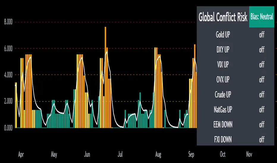
Mongoose Global Conflict Risk Index v1Overview
The Mongoose Global Conflict Risk Index v1 is a multi-asset composite indicator designed to track the early pricing of geopolitical stress and potential conflict risk across global markets. By combining signals from safe havens, volatility indices, energy markets, and emerging market equities, the index provides a normalized 0–10 score with clear bias classifications (Neutral, Caution, Elevated, High, Shock).
This tool is not predictive of headlines but captures when markets are clustering around conflict-sensitive assets before events are widely recognized.
Methodology
The indicator calculates rolling rate-of-change z-scores for eight conflict-sensitive assets:
Gold (XAUUSD) – classic safe haven
US Dollar Index (DXY) – global reserve currency flows
VIX (Equity Volatility) – S&P 500 implied volatility
OVX (Crude Oil Volatility Index) – energy stress gauge
Crude Oil (CL1!) – WTI front contract
Natural Gas (NG1!) – energy security proxy, especially Europe
EEM (Emerging Markets ETF) – global risk capital flight
FXI (China ETF) – Asia/China proxy risk
Rules:
Safe havens and vol indices trigger when z-score > threshold.
Energy triggers when z-score > threshold.
Risk assets trigger when z-score < –threshold.
Each trigger is assigned a weight, summed, normalized, and scaled 0–10.
Bias classification:
0–2: Neutral
2–4: Caution
4–6: Elevated
6–8: High
8–10: Conflict Risk-On
How to Use
Timeframes:
Daily (1D) for strategic signals and early warnings.
4H for event shocks (missiles, sanctions, sudden escalations).
Weekly (1W) for sustained trends and macro build-ups.
What to Look For:
A single trigger (for example, Gold ON) may be noise.
A cluster of 2–3 triggers across Gold, USD, VIX, and Energy often marks early stress pricing.
Elevated readings (>4) = caution; High (>6) = rotation into havens; Shock (>8) = market conviction of conflict risk.
Practical Application:
Monitor as a heatmap of global stress.
Combine with fundamental or headline tracking.
Use alert conditions at ≥4, ≥6, ≥8 for systematic monitoring.
Notes
This indicator is for informational and educational purposes only.
It is not financial advice and should be used in conjunction with other analysis methods.
GSR-MINI BandsGSR-Mini Bands is an indicator designed to analyze the dynamics of implied volatility indices, such as the VIX (S&P500) or the VDAX-NEW (DAX40).
The calculation is performed as the percentage difference between the cumulative series of opening gaps and the cumulative evolution of the volatility index itself, adjusted for those gaps.
The indicator moves in a range of approximately -1 to 1, with intermediate lines (0.3 and 0.7) that help identify different relative levels of volatility behavior.
Although it is primarily designed for daily charts, it can also be applied to shorter time frames, such as 1 minute, where it offers additional insight into intraday volatility dynamics.
Note : This indicator does not constitute an investment recommendation. It is presented solely as a technical analysis tool.

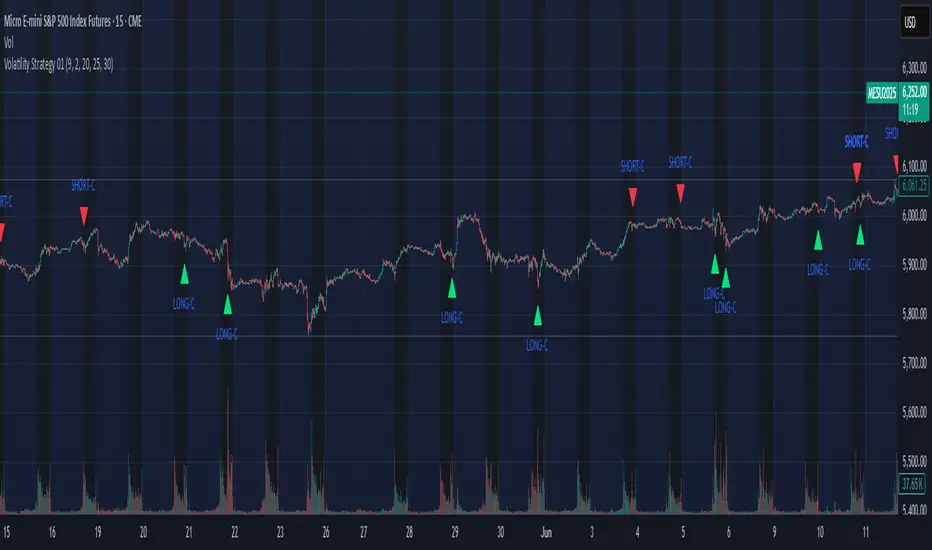
Volatility Strategy 01a quantitative volatility strategy (especially effective in trend direction on the 15min chart on the s&p-index)
the strategy is a rule-based setup, which dynamically adapts to the implied volatility structure (vx1!–vx2!)
context-dependent mean reversion strategy based on multiple timeframes in the vix index
a signal is provided under following conditions:
1. the vvix/vix spread has deviated significantly beyond one standard deviation
2. the vix is positioned above or below 3 moving averages on 3 minor timeframes
3. the trade direction is derived from the projected volatility regime, measured via vx1! and vx2! (cboe)
GEX and OI levelsIntroduction
Harness the power of institutional options flow analysis with the GEX & OI Levels indicator – an advanced tool that brings professional-grade options analytics directly to your TradingView charts. This comprehensive indicator visualizes Gamma Exposure (GEX) and Open Interest (OI) data, revealing hidden market forces that drive price action and potential reversal points. Designed for serious traders who understand that options positioning often precedes price movement.
What Is GEX & OI Levels?
GEX & OI Levels is a sophisticated indicator that analyzes options market positioning through the lens of dealer gamma exposure and open interest concentration. By visualizing where market makers must hedge their options positions, you can identify potential support/resistance levels, price magnets, and likely volatility zones. The indicator processes strike-by-strike options data to generate actionable insights about institutional positioning and potential price behavior.
Key Features
Complete Gamma Exposure Analysis
Dynamic GEX histogram showing dealer positioning at each strike
Visual identification of positive and negative gamma zones
Smoothed total GEX calculation with customizable parameters
Zero gamma level identification - critical price points where dealer behavior changes
Critical Price Level Identification
Gamma flip points that often act as magnets for price
Gamma walls where significant hedging activity may create support/resistance
Golden strike detection where both call and put OI show unusual concentration
Max pain calculation showing the price point where options expiration causes maximum loss
Dealer Positioning Intelligence
Analysis of dealer hedging requirements for price movements
Calculation of expected dealer behavior during rallies and dips
Signal strength indicators showing potential hedging impact
Delta-adjusted GEX for more accurate near-expiration analysis
Comprehensive Data Visualization
Highly configurable visualization of GEX histogram with logarithmic scaling
Strike-by-strike data table with color-coded gamma values
Top OI levels for both calls and puts with customizable highlighting
Detailed metrics panel showing all key GEX and options analytics
Use Cases
1. Identifying Potential Price Magnets
Gamma flip points often act as magnets for price, especially near expiration
Zero gamma levels show where dealer hedging pressure changes direction
Golden strikes reveal where both call and put sellers have significant exposure
2. Discovering Support & Resistance Zones
Gamma walls indicate where dealer hedging may create price barriers
Top OI levels often become psychological support/resistance points
Max pain level shows where options writers have incentive to push price
3. Predicting Market Volatility
Low GEX environments signal potential for increased volatility
High GEX environments typically lead to price compression and reduced volatility
Dealer positioning metrics indicate whether market makers are dampening or amplifying moves
4. Timing Market Reversals
Extreme dealer positioning often precedes market reversals
Proximity to flip points provides timing signals for potential turns
Signal strength measurement helps quantify the potential impact
5. Enhancing Trading Strategy
Align your trades with or against dealer hedging flows
Use dealer positioning analysis to set more precise stop losses and targets
Combine with technical analysis for high-probability trading setups
Customization Options
The indicator offers extensive customization capabilities:
Data Input & Configuration
CSV data input for option chain information
Adjustable DTE (Days To Expiration) settings
Risk-free rate and implied volatility parameters
Custom symbol formatting for different data providers
Calculation Settings
Gamma weight multiplier for sensitivity adjustment
Strike range limitations to focus on relevant price zones
Gamma scaling options based on strike distance
Static IV mode for environments without option price data
Visualization Options
Customizable histogram appearance including scale and transparency
Color settings for positive/negative GEX, flip points, and gamma walls
OI level display with configurable number of levels
Strike data table with adjustable strike count
Analytics Settings
Delta-adjusted GEX for improved accuracy
Dealer positioning analytics with hedge efficiency parameters
Alerting capabilities for price approaching key levels
Golden strike highlighting for significant option activity zones
How to Use
Apply the indicator to your chart
Input your options data in CSV format using the required structure
Configure the expiration date to match your analysis timeframe
Adjust gamma calculation parameters based on your instrument
Use the GEX histogram and key levels to identify potential price targets
Monitor dealer positioning metrics to anticipate market behavior
Trade with confidence knowing where institutional hedging activity is concentrated
Perfect for options traders, futures traders, swing traders, and anyone who wants to incorporate institutional-level options analysis into their technical trading strategy.
Elevate your trading with GEX & OI Levels - where options positioning reveals future price action.

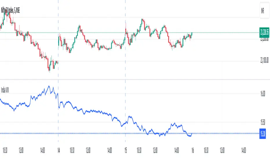
India VIXThe VIX chart represents the Volatility Index, commonly referred to as the "Fear Gauge" of the stock market. It measures the market's expectations of future volatility over the next 30 days, based on the implied volatility of NSE index options. The VIX is often used as an indicator of investor sentiment, reflecting the level of fear or uncertainty in the market.
Here’s a breakdown of what you might observe on a typical VIX chart:
VIX Value: The y-axis typically represents the VIX index value, with higher values indicating higher levels of expected market volatility (more fear or uncertainty), and lower values signaling calm or stable market conditions.
VIX Spikes: Large spikes in the VIX often correspond to market downturns or periods of heightened uncertainty, such as during financial crises or major geopolitical events. A high VIX is often associated with a drop in the stock market.
VIX Drops: A decline in the VIX indicates a reduction in expected market volatility, usually linked with periods of market calm or rising stock prices.
Trend Analysis: Technical traders might use moving averages or other indicators on the VIX chart to assess the potential for future market movements.
Inverse Relationship with the Stock Market: Typically, there is an inverse correlation between the VIX and the stock market. When stocks fall sharply, volatility increases, and the VIX tends to rise. Conversely, when the stock market rallies or remains stable, the VIX tends to fall.
A typical interpretation would be that when the VIX is low, the market is relatively stable, and when the VIX is high, the market is perceived to be uncertain or volatile.
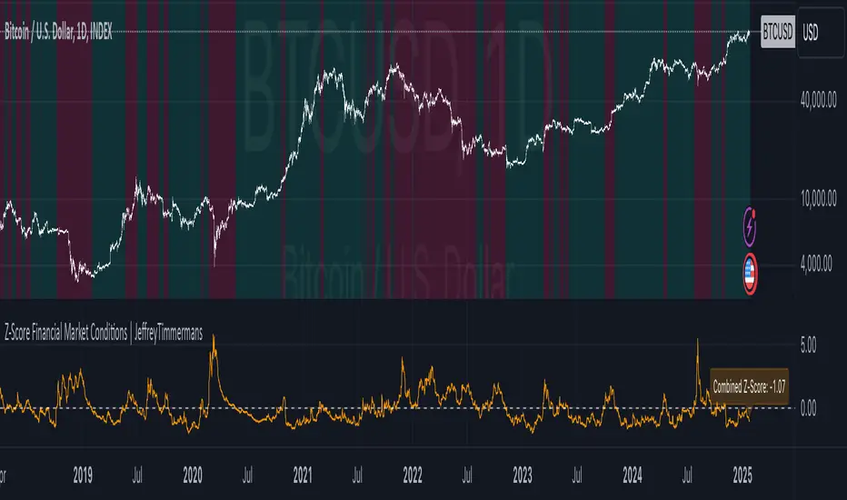
Z-Score Financial Market Conditions | JeffreyTimmermansZ-Score Financial Market Conditions
The Z-Score Financial Market Conditions indicator is a cutting-edge tool for measuring financial market stress and relaxation by combining eight critical financial metrics into a single composite Z-score. This dynamic indicator provides traders and analysts with actionable insights into the overall state of the financial markets, enabling informed decision-making across various trading and investment systems.
Purpose of the Indicator
This indicator serves as a comprehensive gauge of financial market conditions, offering a clear visualization of whether the markets are in a state of stress (elevated risks) or relaxation (normalized conditions). The Z-Score Financial Market Conditions tool is particularly effective for:
Macro-Level Risk Assessment: Identifying periods of high market stress or calmness.
Trend Following Systems: Gauging the market's underlying conditions to validate trends.
Mean Reversion Strategies: Using extreme Z-score levels to detect potential reversals.
Portfolio Risk Management: Adjusting asset exposure based on market-wide financial conditions.
This indicator works exclusively on the 1-day timeframe, as it is calibrated to analyze daily changes in the financial metrics that drive market behavior.
The Eight Key Components and Their Importance
The composite Z-score integrates the Z-scores of the following eight financial metrics. These metrics have been selected for their complementary insights into various aspects of financial market conditions:
VIX (S&P 500 Volatility Index)
Reflects implied volatility in the U.S. equity market.
High VIX values indicate increased uncertainty and risk aversion among market participants.
MOVE (US Treasury Bond Volatility Index)
Captures volatility in U.S. Treasury bonds.
Essential for understanding risk in fixed-income markets, which significantly impact broader economic conditions.
ICE BofA High Yield Option Adjusted Spread (BAMLH0A0HYM2)
Measures the risk premium for high-yield corporate bonds.
Rising spreads suggest increased credit risk and potential economic stress.
ICE BofA Corporate Index Option Adjusted Spread (BAMLC0A0CM)
Tracks credit spreads in the investment-grade bond market.
Helps evaluate the health of higher-quality corporate debt, a key indicator of financial stability.
ICE BofA US High Yield Index Spread (BAMLH0A0HYM2)
Focuses on high-yield U.S. corporate bonds.
Provides localized insights into U.S. credit conditions and risk levels.
CDS (Credit Default Swap Spreads)
Measures the cost of insuring against bond defaults.
Rising CDS spreads signal growing concern over creditworthiness, often a leading indicator of financial stress.
Global Bond Spread (AGG)
Represents global fixed-income spreads.
Offers a broader perspective on international financial conditions beyond the U.S. market.
TED Spread (Treasury-EuroDollar Spread)
The difference between interbank lending rates and short-term U.S. Treasury yields.
Widely regarded as an indicator of systemic risk in the banking sector.
Features and Improvements
This script builds upon the original concept by introducing advanced features to enhance its precision and usability:
Lookback Period Adjustment
A customizable lookback period for Z-score calculations (default: 160 days).
Allows for greater flexibility in adapting to different market conditions.
Moving Average (MA) Smoothing
Optional smoothing of Z-scores using an exponential moving average (EMA) for enhanced clarity.
Default smoothing length: 8 days.
Individual Component Visibility
Plots for individual Z-scores can be enabled or disabled to focus on specific metrics.
Dynamic Background Coloring
Visual cues to indicate bullish (green) or bearish (red) financial conditions based on the composite Z-score.
Custom Inputs
Toggle on/off for each financial metric to tailor the indicator to specific use cases.
Customizable parameters for smoothing and moving averages.
Applications
This indicator is versatile and can be effectively used in various trading systems and strategies:
Long-Term Investment Decision-Making: Assess macroeconomic trends for portfolio rebalancing.
Systematic Trading: Incorporate market conditions into algorithmic models to enhance robustness.
Volatility-Based Strategies: Use Z-score fluctuations to anticipate periods of market turbulence or calm.
Credits
This indicator was inspired by and builds upon the work of TomasOnMarkets . While incorporating significant enhancements, it acknowledges the foundational concepts provided by this original source. Thank you for sharing your input on this important indicator. We are honored to use it and to further improve upon it.
-Jeffrey
CSP Key Level Finder This script is designed for option sellers, particularly those using strategies like cash-secured puts (CSPs), to help automate the process of identifying key levels in the market. The core functionality is to calculate a specific price level where a 5% return can be achieved based on the historical volatility of the underlying asset. This level is visually plotted on a chart to guide traders in making more informed decisions without manually calculating the thresholds themselves.
The script incorporates implied volatility (IV) data to determine the volatility rank of the asset and calculates historical volatility (HV) based on price movements. These volatility measures help assess market conditions. The resulting key level is drawn as a line on the chart, along with a label that includes relevant information about volatility, making it easier for traders to evaluate potential option selling strategies.
Additionally, the script includes user input options, allowing users to control when to display the key level on the chart, offering flexibility based on individual needs. Overall, the script provides a visual aid for option sellers to streamline the process of identifying attractive entry points.

Magic LevelsPS MODS : This indicator calculate the levels based on IndiaVIX, volumes on FnO, cofficient and factor to reach on the level. Hope this can help you to understand the functionality of this Indicator
This indicator is used for draw levels or "Magic Levels/Lines" for Nifty, Bank Nifty and FnO futures, based on volatility (indiavix) calculations. This powerful tool is designed to provide insights into market volatility and assist traders and investors in making informed decisions in the Indian stock market.
As of now the indicator draws levels only on Bank Nifty and Nifty. Soon we'll publish the next update supporting all FnO Futures and stocks.
The India VIX, often referred to as the "Fear Index," is a popular measure of market volatility and investor sentiment. It quantifies the market's expectations of near-term volatility by calculating the implied volatility of NIFTY options. The VIX Levels Indicator utilizes these calculations to draw key levels on price charts, enhancing traders' understanding of potential market movements.
The indicator's main function is to identify critical support and resistance levels derived from IndiaVIX data. We considered to volatility of all the FnO instruments and calculated the mean value keeping the day into consideration while performing the calculations. These levels serve as significant reference points that can help traders gauge potential price reversals, breakouts, and trends. By integrating the Magic Levels Indicator into their analysis, traders can gain a comprehensive view of market dynamics and improve their timing for entering or exiting positions.
Traders can customize the VIX Levels Indicator to suit their preferences, adjusting parameters such as time period where the default is 1 day. This flexibility allows traders to adapt the indicator to different trading strategies and timeframes. Whether a trader focuses on intraday scalping or swing trading, the Magic Levels Indicator can be a valuable addition to their technical analysis toolkit.
MOVE/VXTLT CorrelationMany know of the VIX for equity trading. Yet, many are unaware that there is the same kind of volatility measure for trading bonds, called the MOVE Index.
"The Merrill Lynch Option Volatility Estimate (MOVE) Index is a yield curve weighted index of the normalized implied volatility on 1-month Treasury options which are weighted on the 2, 5, 10, and 30 year contracts."
With this script one can see the the correlation and divergences between bonds and its volatility measure to make educated decisions in trading or hedging.
The idea of this script comes from NicTheMajestic.

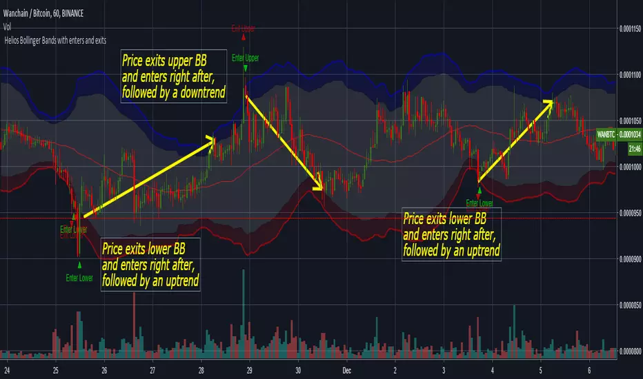
Helios Bollinger Bands with enters and exits by ZekisClassic Bollinger Bands with enters and exits from the channel
The purpose of Bollinger Bands is to provide a relative definition of high and low prices of a market. By definition, prices are high at the upper band and low at the lower band. This definition can aid in rigorous pattern recognition and is useful in comparing price action to the action of indicators to arrive at systematic trading decisions
The use of Bollinger Bands varies widely among traders. Some traders buy when price touches the lower Bollinger Band and exit when price touches the moving average in the center of the bands. Other traders buy when price breaks above the upper Bollinger Band or sell when price falls below the lower Bollinger Band . Moreover, the use of Bollinger Bands is not confined to stock traders; options traders, most notably implied volatility traders, often sell options when Bollinger Bands are historically far apart or buy options when the Bollinger Bands are historically close together, in both instances, expecting volatility to revert towards the average historical volatility level for the stock.
When the bands lie close together, a period of low volatility is indicated. Conversely, as the bands expand, an increase in price action/market volatility is indicated. When the bands have only a slight slope and track approximately parallel for an extended time, the price will generally be found to oscillate between the bands as though in a channel.
Traders are often inclined to use Bollinger Bands with other indicators to confirm price action. In particular, the use of oscillator-like Bollinger Bands will often be coupled with a non-oscillator indicator-like chart patterns or a trendline . If these indicators confirm the recommendation of the Bollinger Bands , the trader will have greater conviction that the bands are predicting correct price action in relation to market volatility .
en.wikipedia.org
Enjoy!
@Zekis
raziel arusi v12
### 🌟 Divine Master V10.1 - Ultimate Hybrid System (Stocks & Options)
**Description:**
The **Divine Master V10.1** is a comprehensive, "All-In-One" algorithmic trading system designed for both long-term investors and short-term traders who demand a complete market overview in a single glance. This system uniquely combines classic technical analysis, institutional trend tracking, and a real-time **Black-Scholes options calculator**.
The standout feature of this version is the **"Smart Portfolio Memory"**, which allows you to save entry prices for up to 12 different assets and track P&L for two separate portfolios simultaneously (e.g., Personal & Family) without re-entering data every time you switch charts.
---
### 🚀 Key Features:
#### 1. 💼 Smart Portfolio Manager
* **12-Asset Memory:** The system automatically detects the ticker you are viewing (e.g., QQQ, NVDA) and retrieves your pre-set entry prices.
* **Dual Tracking:** Calculate P&L (Profit & Loss) in real-time for two separate accounts simultaneously ("Raziel" & "Mom" / Primary & Secondary).
* **Performance Comparison:** A clear display comparing the return on the underlying stock vs. the leveraged return on the option.
#### 2. ⚡ Real-Time Options Simulator (Black-Scholes)
* **Live Pricing:** Calculates the theoretical value of an option (Call/Put) at any given moment based on stock price, DTE (Days to Expiration), and IV (Implied Volatility).
* **Expected Move:** Visualizes a "Purple Box" on the chart, indicating the statistical range the stock is expected to move within until expiration.
* **Smart Recommendations:** Provides textual actionable advice in real-time: "Hold", "Take Profit", "Cut Loss", or warnings about "Divergence".
#### 3. 🏛️ Long-Term Investment Analysis
* **Institutional View (MA 150):** Visual indication of whether the stock is supported by institutional investors (Price above/below the 150-day Moving Average).
* **Macro Trends:** Automatic detection of **Golden Cross** (Bull Market start) and **Death Cross** (Bear Market warning).
* **Drawdown:** Measures the percentage drop from the All-Time High (ATH) to identify value opportunities.
#### 4. 📉 Short-Term Trading Tools
* **Smart Money Filter (Volume):** Identifies abnormal capital inflows (high volume) to validate trade signals.
* **Divergence Hunter:** Alerts on RSI divergences (Bullish/Bearish) to spot potential trend reversals.
* **Squeeze Radar:** Detects low-volatility consolidation periods ("Squeezes") before explosive moves.
* **ATR (Volatility Meter):** Displays volatility levels in percentage (🔥 = High Risk/Expensive Premiums, 🌊 = Calm).
* **Earnings Countdown:** Counts down days to the next earnings report with a red alert warning when the date is near (Risk Management).
#### 5. 📊 Live Dashboard (HUD)
A high-contrast table located at the top-right corner, consolidating all critical data:
* **Weighted Score:** A dynamic score from 0-100 based on all indicators.
* **Win Rate:** Historical success rate of the strategy's signals.
* **Live P&L:** Real-time profit/loss tracking.
* **Actionable Signals:** Clear Buy/Sell/Hold instructions.
---
**Developed by Raziel Arusi.**
*A tool for smart decision-making, combining wisdom and financial practice.*

raziel arusi
### 🌟 Divine Master V10.1 - Ultimate Hybrid System (Stocks & Options)
**Description:**
The **Divine Master V10.1** is a comprehensive, "All-In-One" algorithmic trading system designed for both long-term investors and short-term traders who demand a complete market overview in a single glance. This system uniquely combines classic technical analysis, institutional trend tracking, and a real-time **Black-Scholes options calculator**.
The standout feature of this version is the **"Smart Portfolio Memory"**, which allows you to save entry prices for up to 12 different assets and track P&L for two separate portfolios simultaneously (e.g., Personal & Family) without re-entering data every time you switch charts.
---
### 🚀 Key Features:
#### 1. 💼 Smart Portfolio Manager
* **12-Asset Memory:** The system automatically detects the ticker you are viewing (e.g., QQQ, NVDA) and retrieves your pre-set entry prices.
* **Dual Tracking:** Calculate P&L (Profit & Loss) in real-time for two separate accounts simultaneously ("Raziel" & "Mom" / Primary & Secondary).
* **Performance Comparison:** A clear display comparing the return on the underlying stock vs. the leveraged return on the option.
#### 2. ⚡ Real-Time Options Simulator (Black-Scholes)
* **Live Pricing:** Calculates the theoretical value of an option (Call/Put) at any given moment based on stock price, DTE (Days to Expiration), and IV (Implied Volatility).
* **Expected Move:** Visualizes a "Purple Box" on the chart, indicating the statistical range the stock is expected to move within until expiration.
* **Smart Recommendations:** Provides textual actionable advice in real-time: "Hold", "Take Profit", "Cut Loss", or warnings about "Divergence".
#### 3. 🏛️ Long-Term Investment Analysis
* **Institutional View (MA 150):** Visual indication of whether the stock is supported by institutional investors (Price above/below the 150-day Moving Average).
* **Macro Trends:** Automatic detection of **Golden Cross** (Bull Market start) and **Death Cross** (Bear Market warning).
* **Drawdown:** Measures the percentage drop from the All-Time High (ATH) to identify value opportunities.
#### 4. 📉 Short-Term Trading Tools
* **Smart Money Filter (Volume):** Identifies abnormal capital inflows (high volume) to validate trade signals.
* **Divergence Hunter:** Alerts on RSI divergences (Bullish/Bearish) to spot potential trend reversals.
* **Squeeze Radar:** Detects low-volatility consolidation periods ("Squeezes") before explosive moves.
* **ATR (Volatility Meter):** Displays volatility levels in percentage (🔥 = High Risk/Expensive Premiums, 🌊 = Calm).
* **Earnings Countdown:** Counts down days to the next earnings report with a red alert warning when the date is near (Risk Management).
#### 5. 📊 Live Dashboard (HUD)
A high-contrast table located at the top-right corner, consolidating all critical data:
* **Weighted Score:** A dynamic score from 0-100 based on all indicators.
* **Win Rate:** Historical success rate of the strategy's signals.
* **Live P&L:** Real-time profit/loss tracking.
* **Actionable Signals:** Clear Buy/Sell/Hold instructions.
---
**Developed by Raziel Arusi.**
*A tool for smart decision-making, combining wisdom and financial practice.*

VWAP Implied Volatility BandsThis script takes the built in VWAP function and creates bands using various Volatility Indexes from the CBOE. The script plots the bands at desired multiples, as well as the closing value of the prior day's first set of bands. Users can choose from the following:
VIX(ES), VXN(NQ), RVX(RTY), OVX(CL), GVX(GC), SIV(ZS), CIV(ZC), TYVIX(ZN), EUVIX(EURUSD), BPVIX(GBPUSD)
Upon selecting the desired volatility index, users must change the multiplier to fit the underlying product since the indexes are all calculated differently.
The goal with this script was to use market generated information (IV) to highlight potential trade locations.
IVR = implied volatility rank for volatility productsuse this indicator on VOLATILITY products such as OVX, VIX, GVX .... (search for "volatility")

Institutional Options Matrix [Pro]# Institutional Options Matrix – Whale Flow & Gamma Detector
### 🚀 Stop Trading Single Strikes. Start Trading the Matrix.
Most retail traders make a critical mistake: they analyze a single option strike in isolation. **Institutional Desks do not trade this way.** They trade the volatility surface, sweeping liquidity across the ATM (At-The-Money) and OTM (Out-Of-The-Money) strikes simultaneously.
The **Institutional Options Matrix ** is designed to bridge the gap between retail charts and institutional order flow. It does not just look at price; it aggregates **Volume Pressure, Delta Sensitivity, and Implied Volatility** across a cluster of strikes to detect when "Whales" are positioning for a move.
---
### 🧠 The Quant Logic (How it Works)
This indicator moves beyond simple Moving Averages. It employs **Multi-Strike Cluster Analysis**:
1. **Aggregate Volume Pressure:** Instead of watching just the ATM strike, this algorithm sums the volume of the **ATM + OTM1 + OTM2** strikes. This reveals the true "Sector Sentiment." If the ATM volume is low but OTM volume is spiking, the indicator detects "Speculative Accumulation."
2. **Net Order Flow Histogram:** The histogram at the bottom visualizes the net battle between Call Writers and Put Writers.
* **Green Columns:** Net Call Buying Pressure.
* **Red Columns:** Net Put Buying Pressure.
3. **Smoothed Gamma Detector:** Using a custom smoothing algorithm on Spot vs. Option pricing, the script calculates the rate of change (Gamma). When this spikes, it triggers a **"Gamma Zone"** (Yellow Background), indicating that price is accelerating and Market Makers are likely trapped.
4. **Smart Strike Alignment:** The dashboard monitors the live Spot price. If the market moves significantly away from your selected strike, the dashboard alerts you to **"⚠️ SHIFT TO "**, ensuring you are never trading stale data.
---
### 📊 Key Features
* **Whale Flow Histogram:** Visualizes the aggregate pressure of the top 3 strikes.
* **Gamma Squeeze Zones:** Highlights explosive momentum areas with a yellow background.
* **Dynamic Dashboard:** Displays real-time ATM pricing, Aggregated Volume, and Strike status.
* **Speculation Alerts:** Detects when volume is spiking on OTM strikes (a leading indicator of a breakout).
* **Clean Visuals:** Plots Call (Green) and Put (Red) premiums directly on the chart with simple Buy/Sell triangular signals.
---
### 🛠️ How to Use
**1. Setup:**
* **Asset:** Select Index (NIFTY, BANKNIFTY) or Stock.
* **Expiry:** Enter the current expiry in `YYMMDD` format (e.g., `251212`).
* **Strike:** Enter the current ATM strike manually (e.g., `24500`).
* *Note: Check the dashboard! If it says "⚠️ SHIFT TO...", update your inputs.*
**2. Long Entry (Call Buy):**
* **Signal:** Green Triangle (Call Entry).
* **Confirmation:** Net Flow Histogram is **GREEN** (Positive).
* **Price:** Call Premium (Green Line) crosses above its VWAP.
**3. Short Entry (Put Buy):**
* **Signal:** Red Triangle (Put Entry).
* **Confirmation:** Net Flow Histogram is **RED** (Negative).
* **Price:** Put Premium (Red Line) crosses above its VWAP.
**4. The Gamma Boost:**
* If the background turns **YELLOW**, a Gamma Squeeze is active. These are high-probability, high-velocity moves.
---
### ⚠️ Disclaimer
*This tool is for educational purposes only. Options trading involves significant risk and is not suitable for all investors. This script relies on data provided by TradingView (NSE); delayed data may affect signal accuracy. Always manage your risk.*

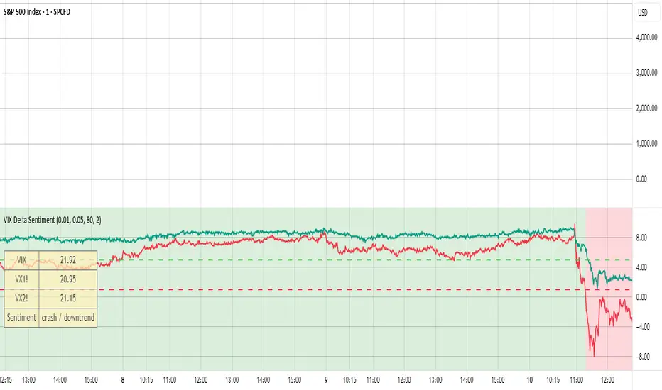
VIX Delta SentimentThis script opens a new panel underneath the main panel.
It displays a table with the values of the CBOE volatility index VIX, which measures the last 30 days implied volatility of the S&P500 index, the VX1! and the VX2! values, which are the front month and the second month VIX futures.
To curves are plotted: the relative difference or delta of the two VIX futures as well as the relative delta between VIX and the first futures month. The dotted lines visualize the thresholds of these two relative deltas.
These values are needed to determine the market sentiment and to trigger a crash alert before it happens. It can be used to trade the major indices SPX, QQQ, etc. or to avoid catastrophic losses.
The market sentiment is annotated in the table and also visualized as background color.